 |
| Graph #1: Same as Graph #3 from yesterday, but showing 1790-2014 |
Tuesday, March 31, 2015
Monday, March 30, 2015
 Pushing the Incalculable into the Past
If you leave out the debt that you don't know how to adjust for inflation -- like all the Federal debt from before 1947 -- your graph looks like this
 |
| Graph #1: From mine of 22 March 2015 |
 |
| Graph #2: Data subset from mine of 29 March 2015 |
Hey, if you take nominal as a percent of real, blue as a percent of red on Graph #2, you can see the effect of inflation on debt:
 |
| Graph #3: Relation of the two lines on Graph #2 |
Sunday, March 29, 2015
From scratch
I have to recreate this graph:
The blue line is GFDGDPA188S at FRED. It is calculated from Gross Federal Debt (FYGFD) and Gross Domestic Product (GDPA).
The red line takes changes in Gross Federal Debt (FYGFD), strips away inflation using the GDP Deflator (GDPDEF at FRED), and keeps a running total of the adjusted values. And I divided that running total by Real GDP (GDPCA) to get a ratio of reals.
I have to recreate the graph because I ignored debt before 1947, figuring it was small by today's standards. But it was large in comparison to GDP. Comments on my calculation have raised doubts in my mind.
I was thinking about pushing the start-date farther back in time. FRED's FYGFD goes back to 1939, GDPA to 1929. I'm sure I can get numbers for Federal debt before 1939, at least back to 1929.
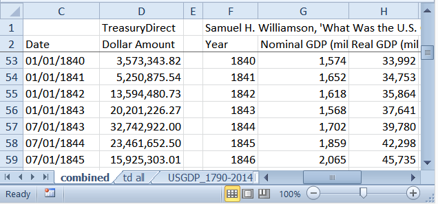
TreasuryDirect has it. Reverse chronological. Of course. But they go all the way back to 1790.
Measuringworth has nominal GDP and real GDP and the GDP Deflator, also all the way back to 1790. And suddenly I realized I have everything needed to show the graph all the way back to 1790. Wow.
Well Auburn, I guess that's why I'm using Federal debt.

I had some trouble getting the TreasuryDirect data into a useful form. There are five separate tables, and when I copied them and pasted into Notepad, two of them ended up with quote marks around the debt numbers. One of the two came into Excel just fine. The other one turned out to be a six hour headache.
Finally, after I gave up on it, I asked the wife if she had a way to convert stubborn data like that. She's a practical girl. She took the TreasuryDirect data, pasted it into Word, searched for quotation marks and replaced them with spaces, then copied it to Excel and Presto, my problem was solved. I think it took her six minutes to do what I couldn't do in six hours.
I went back to TreasuryDirect the next morning and took samples from all five tables, so I could show you. But none of the numbers came out surrounded by quotation marks, and all of them copied over to Excel just fine.
I don't know why.
After I got all the Federal debt data from TreasuryDirect into Excel, and into one file, and into chronological order, I brought in the GDP, Real GDP, and Deflator data from Measuringworth. That part was easy.
But more preparation was needed. I had the 1790 data from both sources on the same row. But the 2014 numbers were on different rows. TreasuryDirect provides one more data item than does Measuringworth, in the 1790-2014 period. That sounds odd, but I was expecting it. The notes for the TreasuryDirect data say
The first fiscal year for the U.S. Government started Jan. 1, 1789. Congress changed the beginning of the fiscal year from Jan. 1 to Jul. 1 in 1842, and finally from Jul. 1 to Oct. 1 in 1977 where it remains today.
I knew about the 1977 change. I've had to correct for extra data there once or twice before. I didn't know about the 1842 change, but given the date it was easy to find:
I suppose the law was passed in 1842 but was not implemented until 1843.
All I had to do was delete one of the two 1843 items. But which? I want to keep the 07-01-1843 entry because the debt is unusually high at that point and it probably means something.
Couple other fixes I had to make before the data was useful. Measuringworth's GDP and RGDP are in millions; the TreasuryDirect data is in dollars. Usually I have to convert Measuringworth data to billions to match FRED's units. But this time I can convert the TD data to millions and leave the rest as is.
I put commas in the numbers, as TD had, to improve readability.
A boring note on the spreadsheet column labels:
I use NGDP for "nominal", and RGDP for "Real", GDP. Anything in the spreadsheet labeled "Debt" refers to Federal debt and traces back to the TreasuryDirect numbers in Column B (unfortunately shown as Column D in the preliminary snip above). And the symbol "Δ" ("delta") means "change in". So "Δ Debt" reads as "change in debt". You might be more comfortable thinking of it as annual deficits.
That much, I hope, is obvious. Now it gets a little messy. If "Δ Debt" in Column G (of the final version) is the deficit, then "R Δ Debt" in Column H is the "Real" (inflation-adjusted) deficit.
In Column J, "Δ Debt" is reduced to "ΔD" to make room for "Accum". In the "ΔD Accum" column I add up the changes in debt. ("Accum" is "Accumulated".) So the accumulated deficit numbers in Column J are equal to the debt numbers in Column B except the number for 1790 is missing. That number is missing because the year before 1790 is missing, so 1790's change from previous year value cannot be calculated.
The same is true for Column K, where "RΔD Accum" stands for "Real Change in Debt, Accumulated"... or the running total of inflation-adjusted deficits.
Column M is the same as Column J, except instead of leaving 1790's "change from previous year" blank, it uses the entire debt 71.06 million dollar Federal debt of 1790. Using that start value, then adding each year's change in debt, all the values in Column M match the original Federal debt values from Column B.
Column M is sort of like checking my work. The next column, N, takes that original 1790 number for the debt and adjusts that whole lump sum for inflation by using the 1790 Deflator number.
That is exactly the same calculation that is commonly used when the "real" (inflation adjusted) value of debt is figured. All of the Federal debt existing (in this case) in 1790 is adjusted using the 1790 deflator number. This is a bad calculation, I say, because much of the debt existing in 1790 (or in any one year) was accumulated in prior years -- and really should be adjusted by the deflator values of those prior years.
I think this is much more of a problem for recent years' debt than for ancient debt. So I'm hesitantly willing to use the flawed calculation for the ancient 1790 number. I couldn't bring myself to use it for the 1947 number in last weekend's calculations, and I very rightly got called out for it.
So, from four columns of source data (B, C, D, E) I have generated six columns of calculated data (G, H, J, K, M, N) -- three columns nominal and three columns inflation-adjusted. The three in each case include one for deficits and two for debt. Which of the two is the better debt measure is still unresolved in my mind.
Based on these six calculated columns I created six additional columns -- in each case the "as a percent of GDP" version. The three nominal columns are shown as percent of nominal GDP, and the three real columns are shown as percent of real GDP.
 |
| From the Open Office Spreadsheet: Long View.ods at Google Drive |
Saturday, March 28, 2015
cracks me up

"Historical" they call that? Since the year 2000??
When I think "historical" data, I think stuff from the 1800s. Or at least, stuff from before the 1947 start-date that FRED uses so often. It's only one financial cycle -- or less -- if we start in 1947. I need more.
a private moment
I have no post for this morning.
My desk was a mess so I had to clean up. But most of the mess turned out to be stuff that had to go in my wallet, new medical cards and some kind of value card from an automobile dealer I'll never go back to for the rest of my life.
Anyway, that meant I had to clean out my wallet. What was in there? Some cash. Money left over from my weekly allowance. My wallet has become my best savings account since the coffee shop closed a few years back.
Some credit cards were in there, too. And some medical cards. Oh, and six registrations for my car, five old ones and one current. I never know when to throw things out. I guess if I have six of them, I should throw out at least three...
But it got me thinking: Cash I understand. There it is, in my wallet, and there it sits until I spend it. There is a kind of simplicity in that, that I like.
I don't understand the cards. They have dates on them -- getting hard to read 'em these days -- that tell me when the cards expire. But I don't go thru my wallet every week looking for expired cards. So they tend to collect in there.
Medical cards, too. There's no dates on 'em -- well, the new ones have dates. That's what got this whole rigmarole going, I got new medical cards. That means the old ones are no longer valid. Or they won't be valid soon, so do I keep them for a little longer? Yeah maybe I don't know. If I throw them out and then I need them, I'll be in trouble. It's easier to keep them just in case.
Yeah the new medical cards do have a date on them. I got two sets, apparently identical. After looking at them a long while I noticed one set is dated March 2015 and the other is dated March 2014. Why did I get them both on the same day? I don't understand the cards.
Well, I threw out all but two of my car registrations, and all the medical cards except the two sets that came the other day. And I found an old library card and two old credit cards that had expired and I could throw them out.
How do you do that? You can't just throw out the credit cards. You have to cut them up in little pieces.
Tiny little pieces? How tiny? Usually I cut thru the important numbers and throw away pieces of the card into two or three different garbages. First, though, I take the cut pieces and cut them up tiny. As tiny as I can for as long as I can stand to keep doing that, and then I just throw the rest away. I hope the thieves will appreciate my efforts, and leave the big pieces alone.
Well, it's four o'clock.
Friday, March 27, 2015
"The TPP has developed in secret an unaccountable supranational court for multinationals to sue states. This system is a challenge to parliamentary and judicial sovereignty."
There's more to it than similie and metaphor
Unfortunately, we know what money is the same way the fabled Blind Men of Hindustan know what an elephant is: the one who grabbed the trunk knows it is “like a tree”...
Wait a minute! I thought the leg was like a tree...
In What Is Money And How Is It Created?, Steve Keen writes:
... they haven’t worked out what money really is. Only one person ever really ever did—and no, it wasn’t Ayn Rand. It was Augusto Graziani, an Italian Professor of Economics, who died early last year. He understood what money is because he posed and correctly answered a simple question: how does a monetary economy differ from one in which trade occurs by barter?
This ruled out gold being money, since gold is a commodity that anyone can produce for themselves with a bit of mining (and a lot of luck). So even though gold is really special and incredibly rare, it is in the end, a commodity: an economy using gold for trade is really a barter economy, not a monetary one.
This ruled out gold being money, since gold is a commodity that anyone can produce for themselves with a bit of mining (and a lot of luck). So even though gold is really special and incredibly rare, it is in the end, a commodity: an economy using gold for trade is really a barter economy, not a monetary one.
First time I read that, I thought it was great: If we're trading gold for other things, it's a barter economy. But I changed my mind. The notion that gold is the same as money is an oversimplification, a gross oversimplification. One could as well argue that if we're trading green paper for other things it's a barter economy. Or for that matter, if we're trading electronic ones and zeroes for other things, it's a barter economy. It's an oversimplification that ignores the concept of value.
Money captures value.
Thursday, March 26, 2015
Oh, my!
With Anonymous 2:09's correction, my graph looks totally different:
 |
| Federal Debt Prior to 1947 is not ignored in this graph |
I have to look at this, and think about it. Not tomorrow but probably Saturday the topic will return.
Necessity is the mother of invention
"Just as it is possible to construct a theory of the emergence of money based on principles of agent preference and action," writes James Caton in The Emergence of the State Monopoly over Money, "so too is it possible to build a theory of the state monopoly of money with such principles."
It's possible, I suppose. But it seems to me that if you are considering the emergence of the state monopoly over money, you would want to base your theory at least in part on the historical record. As opposed to just making shit up.
Wednesday, March 25, 2015
I didn't verify the numbers, but...
Michael Snyder at The Economic Collapse writes
I have shared these next numbers before, but they bear repeating. In America today, most Americans do not make enough to support a middle class lifestyle on a single salary. The following figures come directly from the Social Security Administration…
-39 percent of American workers make less than $20,000 a year.
-52 percent of American workers make less than $30,000 a year.
-63 percent of American workers make less than $40,000 a year.
-72 percent of American workers make less than $50,000 a year.
We all know people that are working part-time jobs because that is all that they can find in this economy. As the quality of our jobs continues to deteriorate, the numbers above are going to become even more dismal.
Tuesday, March 24, 2015
The Economy is the Model
Gavin Kennedy on Adam Smith:
Smith warned against arranging people as if they were wooden pieces on a chess board, moved at will by theorists (and fanatics), who forgot that every single person moved through life entirely under their own volition. Modern economists have substituted the arguments of their equations for the very essence of real societies peopled by real individuals.
Monday, March 23, 2015
A Quick Follow-Up on Models
JW Mason:
The test of a good model is not whether it corresponds to the true underlying structure of the world, but whether it usefully captures some of the regularities in the concrete phenomena we observe.
Okay... that's good, that's good. A model doesn't have to be right. It just has to explain the phenomena we observe. Sometimes, though, phenomenological explanations are a bit difficult to grasp. Perhaps an example will aid the understanding?
Theorists set the stage:
For years it has been believed that electric bulbs emitted light.
However recent information from Bell Labs has proven otherwise.
Electric bulbs don't emit light, they suck dark. Thus, they now call these bulbs dark-suckers. The dark theory, according to a Bell Labs spokesman, proves the existence of dark, that dark has mass heavier than that of light, and that dark is faster than light. The basis of the dark-sucker theory is that electric bulbs suck dark.
Empiricists capture some of the regularities:
There is less dark near the electric bulb than at a distance of 100 feet when it is operating; therefore, it is sucking dark and can be classified as a dark sucker. The larger the dark sucker, the greater the distance it can suck dark. The larger the dark sucker the greater its capacity of dark. The dark sucking capabilities are evident when the dark sucker has reached its capacity and will no longer suck dark. At that point you may notice the dark area on the inside portion of the dark sucker...
There is more dark 30 feet from a lit candle then there is at a distance of 3 feet. Proof of it's dark sucking capabilities is relatively simple. Examine a new unused candle, notice that the center core is not dark. Ignite the center core. Allow the center core to burn for about 5 minutes. Notice the lack of dark around the candle. Extinguish the candle flame. Notice that the center core of the candle is now dark... Ignite the center core and allow it to burn for a minimum of 2 minutes. Pass a clean pencil over the top of the flame, left to right, approximately 3 inches above the center core. Notice that there is no dark on the pencil. Pass the pencil over the center core now about 1/2 inch. Notice that the pencil now has a dark area. The pencil blocked the path of the dark being sucked to the core of the dark sucker...
Dark is heavier than light. Dark always settles to the bottom of a lake and/or river. Submerge just below the surface of a lake and you will notice an absence of dark. Lower yourself to 15 feet below the surface and you will notice a degree of darkness even on a sunny, bright day. Lower yourself to 50 feet (or more) below the surface and you are in total dark. Ergo, the dark has settled to the bottom; therefore, dark is heavier than light...
Dark is faster than light. If you would open a drawer very slowly, you will notice that the light goes into the drawer. (You can see this happen.) You cannot see the dark leave the drawer. Continue to open the drawer and light will continue to enter the drawer; however, you will not see any dark leave the drawer. Therefore, dark is faster than light. Go into a closet, close the door, and turn off the dark sucker. Have a friend open the door about 1 inch. Your friend will not see any dark leave the closet, nor will you. Have your friend open the door until half the closet is dark and half is light. Since 2 objects cannot occupy the same space at the same time, and you do not feel any change in pressure, by compressing the dark, it is logical to assume that dark is faster than light.
There ya go.
Sunday, March 22, 2015
Living in the Nominal World
Yesterday we were looking at this graph, the same that Noah showed:
 |
| Graph #1: Total Public Debt as a Percent of GDP |
I want to use this graph instead:
 |
| Graph #2: Gross Federal Debt as a Percent of GDP |
The two are quite similar, both of them ending near 100% of GDP. The second graph is less jiggy because it uses annual numbers rather than quarterly. Less jiggy? No biggie.
FRED's notes for our Graph #2 here tell me they used the FYGFD data series for the Federal debt. This series. But instead of looking at debt to GDP as they do, first I want to see debt in billions. And instead of looking at the whole Federal debt, I just want to look at the changes from one year to the next. I want to see each year's addition to the total. That will be like looking at Federal deficits. This graph shows the data I want to start with:
 |
| Graph #3: Annual Change in Gross Federal Debt, billions |
Oh, that's it: Yesterday we were looking at Federal deficits as a percent of GDP. Yeah. As a percent of GDP the deficits were trending down from around 1983 to the year 2000. But as raw numbers, debt in billions sans context, deficits were going up during that same period. Okay. Now I get it.
One other thing about Graph #3: Compare it to the data series that shows the Federal deficit, and the two are similar but not the same. They have the same pattern, and the two lines are very close until 1985. But for 1985 and after, a gap opens up and the numbers are not the same. Looks like they've been doing some creative accounting since that time.
I still want to use the change-in-debt numbers from Graph #3. But I thought you should know about this discrepancy.
Looking at Graph #3 now, each point on the line represents a year, the change in Federal debt for one year. But I was thinking, there was some pretty serious inflation in the 1960s and 1970s. All the numbers since then are higher than the earlier numbers because of the inflation. I can take the inflation out of the numbers and graph the result, and maybe we can see how inflation changed the Federal debt.
Yeah, let's do that. It's the same calculation you'd use to calculate "Real GDP" from "Nominal GDP". Here ya go:
 |
| Graph #4: Nominal (blue) and Inflation-Adjusted (red) Annual Changes in Gross Federal Debt. |
Now I can take and add them up, and that'll give me a number for the Federal debt with inflation removed. It'll be in 2009 dollars, because the GDP Deflator uses 2009 dollars.
I downloaded the data from Graph #4, and added up the inflation-adjusted changes in Federal debt.
It's funny though. I'm adding up the changes to the Federal debt since 1947. That means I'm not counting any of the World War Two debt or any Federal debt from before that time. We're starting with a low number, for sure.
I can't add up the numbers in a FRED graph, so I used Excel. I put my inflation-adjusted Federal debt numbers on the graph in red. And I put the blue line from Graph #2 on my Excel graph for comparison (but only since 1947. You don't see the wartime increase of the early 1940s). Here's what I got:
|
| Graph #5: Nominal (blue) and Inflation Adjusted (red) Gross Federal Debt as Percent of GDP You can view or download the Excel file from Google Drive |
Noah asks Why did rich-world deficits start exploding around 1980?
They didn't, I reply.
It does look like deficits "exploded" around 1980. But when you strip away the effects of inflation, there is no sudden change from downhill to uphill in the early 1980s. So I guess you can say there was a sudden change in the early 1980s but only because the raging inflation came to an end.
Inflation aside, as the red line shows, the Federal debt was increasing as a percent of GDP since the end of the second World War. And I think we can see a more rapid increase starting around 1974. That's not 1980, that's 1974. These things are hidden when we look at the blue line -- which is how everybody looks at Federal debt, by the way -- because inflation and the falling value of the dollar allow us to understate the value of past debts.
Thankfully, we live in a nominal world. If not for the effects of inflation, we would not have seen the Federal debt falling for thirty-plus years after World War Two.
And if not for the effects of inflation, the significant increase in Federal debt growth would have occurred around 1974, not around 1982. And that is a biggie. It is important, because people key in on the date, look at the events of the time, and understand the economy based on what they see.
Noah, for example, says the U.S. Federal deficit had been decreasing since WW2, then suddenly began to trend upward around 1980. He then offers a theory to explain why that happened.
I'm not offering a theory. I'm showing you numbers, and I'm saying it only happened that way because of inflation. Oh, and it's not a theory. It's a fact.
If you don't start with facts, even your best theories are bullshit.
Saturday, March 21, 2015
They didn't
Why did rich-world deficits start exploding around 1980? asks Noah Smith.
You already know my answer: They didn't. Now I can read his post, and reply.
Noah writes:
The U.S. federal deficit, which had been decreasing since the end of WW2, began to trend upward beginning around 1980
Then he shows a picture of the U.S. Federal debt (not the deficit) ...
|
| Graph #1: Noah's Measure of the Federal Deficit |
Silly Noah.
He immediately explains (in a very short paragraph) that "the proximate cause was big tax cuts". But he wants to talk about the political-economic cause. "I have a theory" he says.
Yeah, Noah, I bet you do.
But I didn't get any farther than that, reading his post. I had to stop reading and start responding. So I don't yet know what his theory might be. Before we look at Noah's theory...
Before we look at Noah's explanation of something that didn't really happen -- his explanation of why it happened, I mean -- let's pause long enough to see whether it really happened, or not.
1. Stock and Flow
Debt is a stock. Deficits are a flow. A deficit is the addition to debt during a well-defined short period of time. A debt is the sum total of deficits accumulated over a continuous series of those time periods. So obviously, since "debt" takes a whole bunch of "deficits" and adds them all together, a "debt" is going to be a lot bigger than a "deficit". Look at it on a graph and, if you're a little naive, you might even think the debt is "exploding".
Here is the FRED graph Noah used. It goes all the way back to 1966. Whoop dee doo.
For the next graph, I took Noah's graph and added a line for the U.S. Federal deficits, the flow number. Mine (red) is shown as a percent of GDP, just like Noah's (blue).
.PNG) |
| Graph #2: U.S. Federal Debt (blue) and Deficit (red). The blue line is the same as on Graph #1 (Click the graph to see the FRED source page.) |
When numbers "explode" on a graph, you expect to see a line going up, fast. That's what I expect. That's what Noah was showing us with his Federal debt graph: After the early 1980s, the line goes up sharply. Too bad his graph doesn't show deficits.
A deficit is a shortage, of course. If a deficit is a hole in the ground, then a bigger deficit is a bigger hole. As deficits get bigger, the line on a graph goes down. I don't know why FRED shows it that way, but they do. That's why the red line is almost all below zero on Graph #2.
It's not intuitive. But that's okay. If deficits were "exploding" we'd see the red line go down a lot. Myself, I don't see that on Graph #2.
I know what would help. We can get rid of the blue line and just look at the red line. We can give all the space to the red line and let it expand to use the available space. (FRED will expand it automatically when I remove the blue line.) Then maybe the little wiggles will look like explosions.
But if I'm gonna do that, I'm also gonna put a minus sign in front of the data series, to invert the line. That way, bigger deficits will go up on the graph, instead of down. It'll just make more sense.
2. Go with the Flow.
Here are the deficits that Noah didn't show us:
.PNG) |
| Graph #3: U.S Federal Deficits as Percent of GDP (inverted, so higher is bigger) |
Yes, it's satisfying to see some action in the line on the graph. But you have to remember it's the same red line on graph #3 and on Graph #2. We're just taking a closer look.
So do we see "explosions" on Graph #3? Remember, Noah says deficits started exploding around 1980. Do you see that in the U.S. data? I don't.
I see the growth of deficits peaking around 1980 -- in 1983 actually -- and going downhill after that until the year 2000. And then maybe, an explosion after the year 2000. Here, I eyeballed in some trend lines:
%2Bplus%2BTrends%2Bby%2BEye.png) |
| Graph #4: U.S Federal Deficits as Percent of GDP (with some trend lines just by eye) |
Hey if you look at the bottom part of Graph #4, above, just below the dates there's a squeezed-down version of the graph that shows how much of the data we're looking at. We're only looking at half, a little more than half of it. That's because Noah was looking at a data series that starts in 1966, and I didn't change the dates yet. I'll do that now. But first, look at that squeezed down version again. Look at the left-hand part, the years before 1966. You can see a big hump there. Probably everybody knows that hump is from World War Two. Yeah, let's look at that.
.PNG) |
| Graph #5: U.S Federal Deficits as Percent of GDP, all years. Inverted so big is up. |
Okay, deficits were increasing since the 1970s -- or since the 1950s, really -- and deficits remained relatively high for an extended period, from the mid-1970s to the mid-1990s. And a bunch of high deficits one after the other should make the debt graph show an explosion. Sure.
And yes, Noah's graph shows a sudden, sharp, and persistent increase in debt from the early 1980s to the mid 1990s. But that is not an explosion of deficits. If you insist on calling it an explosion, it is an explosion of debt. Deficits tended to get smaller after the early 1980s, as a percent of GDP (and that's Noah's yardstick).
3. A Discrepancy
Well, Noah says the explosion started "around 1980". And you can see it in his graph. Checking his graph at FRED, it appears that the increase in debt started after 1981 Q3. The increase in debt as a percent of GDP.
 |
| Graph #6: Noah's graph of the U.S. Federal Debt, again |
Why, from 1976 to 1981, does Noah's graph trend downhill? Why doesn't it show increase since 1970? Hey, I wouldn't be asking the question if I didn't think I knew the answer: Inflation skews the numbers.
To be continued...
Friday, March 20, 2015
"a keen ear for unwarranted analogies"
Gene Callahan quotes from computer scientist E. W. Dijkstra
It is probably more illuminating to go a little bit further back, to the Middle Ages. One of its characteristics was that 'reasoning by analogy' was rampant; another characteristic was almost total intellectual stagnation, and we now see why the two go together. A reason for mentioning this is to point out that, by developing a keen ear for unwarranted analogies, one can detect a lot of medieval thinking today.
I went to the source for more:
The usual way in which we plan today for tomorrow is in yesterday's vocabulary. We do so, because we try to get away with the concepts we are familiar with and that have acquired their meanings in our past experience. Of course, the words and the concepts don't quite fit because our future differs from our past, but then we stretch them a little bit. Linguists are quite familiar with the phenomenon that the meanings of words evolve over time, but also know that this is a slow and gradual process.
It is the most common way of trying to cope with novelty: by means of metaphors and analogies we try to link the new to the old, the novel to the familiar. Under sufficiently slow and gradual change, it works reasonably well; in the case of a sharp discontinuity, however, the method breaks down: though we may glorify it with the name "common sense", our past experience is no longer relevant, the analogies become too shallow, and the metaphors become more misleading than illuminating.
It is the most common way of trying to cope with novelty: by means of metaphors and analogies we try to link the new to the old, the novel to the familiar. Under sufficiently slow and gradual change, it works reasonably well; in the case of a sharp discontinuity, however, the method breaks down: though we may glorify it with the name "common sense", our past experience is no longer relevant, the analogies become too shallow, and the metaphors become more misleading than illuminating.
Thursday, March 19, 2015
Excuses
History's details are excuses, not explanations.
 |
| Source: 4dtraveler |
A lot of people look at details like those eleven. I don't. If all the different details, ten out of eleven, all have the same apparent effect on the dollar, then really those details are of little consequence. There must be something else -- one abiding factor -- that is responsible for the dollar's decline.
Oh, and did you notice? The first of those arrows points to "Federal Reserve Established". But that first arrow points to a spot well down the slope from the high point of the dollar's value on that graph. So clearly, we have to say that the decline of the dollar was well under way before the Federal Reserve was created.
One abiding factor. Not the Federal Reserve.
Wednesday, March 18, 2015
Five-Digit Years
A little bit from hive.org:
The History of Entrepreneurship
By Ryan AllisThe Beginnings of Trade
The original entrepreneurs were, of course, traders and merchants. The first known instance of humans trading comes from New Guinea around 17,000 BCE, where locals exchanged obsidian, a black volcanic glass used to make hunting arrowheads for other needed goods. These early entrepreneurs exchanged one set of goods for another.
Around 15,000 BCE, the first animal domestication began taking place, and around 10,000 BCE, the first domestication of plants. This step toward agriculture was critical for the advancement of the human species. Now, instead of having to continually move around as nomadic tribes, seeking new places to hunt and to gather, we could stay in one place. Agriculture allowed us to start to form larger stationary communities and cities (the basis for civilizations), which set the stage for the development and spread of human knowledge. Agriculture changed everything...
When the last Ice Age ended around the year 8,000 BCE, the poles melted, raising sea levels and creating a divide between Siberia and North America. This divide created two separate human civilizations for nearly 10,000 years, until European explorers reached the Americas again in the 15th century.
Tuesday, March 17, 2015
It's okay to say anything at all about a graph, I guess
Charles Hugh Smith offers The One Chart You Need to Predict the Future. He begins by stating the idea we are supposed to take from his post:
We are witnessing a profound secular sea-change: the failure of expanding debt and leverage to lift the real economy of wages and household income.

Debt no longer boosts income.
No "profound secular sea-change". No "witnessing". Not even a "we". And no "failure to lift the real economy".
No flowers. No hats. No photographs of self playing a guitar in Neverland... And no 316 Members either, I guess.
So it goes.
We are witnessing a profound secular sea-change: the failure of expanding debt and leverage to lift the real economy of wages and household income.
Everybody knows we have too much debt, and everybody knows we don't have enough household income. So right off the bat everybody agrees with Charles Huge Smith. He even got me with that, the first time I read it.
After that topic sentence or theme sentence or whatever it is, Charles gets down to business:
When push comes to shove, you only need one chart to predict the future: debt and wages ( credit and compensation).
The bold is his.
I would point out, though, that debt is not the same as credit. Nor is wages the same as compensation. You know damn well when somebody shows a graph of wages falling behind productivity, somebody else will show a graph of compensation keeping up with productivity. Nonetheless, Charles Hugh Smith seems to think he needs to explain to us that "wages" means "compensation". It's crappy
Chuck continues:
This chart displays debt and wages as a ratio: debt/wages. What it reveals is the endgame of financialization: creating more debt no longer pushes wages higher.That brings us back to his opening thought.
Now he shows the

Chuckie's graph runs flat or uphill from 1960 to that godawful peak in 2009. Downhill thereafter. But it doesn't show what he says it shows. Not even close.
The graph shows debt relative to wages: debt divided by wages. The more the debt, the higher the line goes. The more the wages, the lower the line goes.
From 1960 to 2009, when the line goes up, the graph shows that debt was increasing faster than wages. Since 2009, where the line goes down, it shows that wages were increasing faster than debt. So when Charles Hugh Smith points to the years since 2009 on the graph and describes it as
diminishing returns on additional debt -- more debt no longer pushes wages higher
well, he has it exactly wrong. The line is going down since 2009. That means wages have been increasing faster than debt since 2009.
Worst case, wages are decreasing more slowly than debt. We cannot tell from the graph if wages are increasing or decreasing, because the graph shows a ratio. It does not show wages, and it does not show debt. It shows the relation between debt and wages. We can not know from the graph whether debt ever pushed wages higher. It's a boldly false assumption to claim that it has. No wonder Charles Hugh Smith follows his post with his standard disclaimer:
The owner of this blog makes no representations as to the accuracy or completeness of any information on this site
For more, see my comment at the Reddit link.
Monday, March 16, 2015
Why inequality matters

I was at Gene Callahan's and saw something in his sidebar that I had to read. I went with the same title.
Inequality matters because (1.) capital endures through time, as dkuehn says; and (2.) accumulation requires a source. If wealth accumulates by a skimming that creates poverty, then accumulation destroys the environment it needs to survive, and ultimately destroys itself. Civilizations die by suicide, as Toynbee said.
I read an old paperback by Heilbroner long ago. In it he said he didn't expect capitalism to last another N years. That's the problem. That's the reason inequality matters. Capitalism is not sustainable because a growing inequality changes the economic environment.
It has nothing to do with fairness or ethical significance.
Sunday, March 15, 2015
This is cost
Geerussell links to Bill Mitchell from 2012. This part catches my eye:
The neo-classical production function analysis, which is standard in most textbooks, assumes that in the short-run, will all other productive inputs (capital, land etc) fixed, output will increase at a decreasing rate as more hours of employment are used by firms.
This is the so-called Law of Diminishing Marginal Productivity and allows economists of this persuasion to postulate an increasing marginal cost relationship with respect to output (costs increase at an increasing rate as more output is produced).
This is the so-called Law of Diminishing Marginal Productivity and allows economists of this persuasion to postulate an increasing marginal cost relationship with respect to output (costs increase at an increasing rate as more output is produced).
From that excerpt I take this:
The Law of Diminishing Marginal Productivity lets you say costs increase at an increasing rate as more output is produced.
To be sure, Mitchell says The Law of Diminishing Marginal Productivity "is a theoretical construct – an unproven assertion. No conclusive empirical evidence has ever been assembled to substantiate the “the Law” as a reasonable generalization of production relationships in modern monetary economies."
Okay, that's fine. I'm not arguing for or against the law of diminishing marginal productivity. I'm just trying to look at it for a moment.
What I see is "cost". The word "cost". If the Law of Diminishing Marginal Productivity is true, then it operates by affecting cost. This is what makes the concept powerful.
Here is what I think:
The economy is composed entirely of transactions. In every transaction, cost is a consideration; often it is the most important consideration...
Because the economy consists of transactions, because transactions always occur at the intersection of cost and price, and because cost is always the limiting factor -- we are always willing to accept more in payment, but we are not always willing to pay more -- cost is the most significant of all of economic forces.
Because the economy consists of transactions, because transactions always occur at the intersection of cost and price, and because cost is always the limiting factor -- we are always willing to accept more in payment, but we are not always willing to pay more -- cost is the most significant of all of economic forces.
So, the Law of Diminishing Marginal Productivity gets its power from the cost it imposes on the economy. No matter the cost may be imaginary. Cost -- or the vision of cost -- gives it power. You can't get around cost.
I bring this up because my argument is also a cost argument:
Imagine a world where there is $3.50 of debt for every dollar of spending-money. Now, gradually, over 60 years, the level of debt increases to $35.00 for every dollar of spending-money.
 |
| Graph #1: Dollars of Total (Public and Private) Debt, for Each Dollar of Spending Money |
If the interest rate is fixed at one percent, then at the start debt imposes a cost of 3½ cents on every dollar of spending-money. By the end, debt imposes a cost of 35 cents on every dollar.
If the interest rate is three percent, the interest cost is 10 cents per dollar at the start. By the end, the entire dollar is absorbed into interest. This is the cost of finance.
This is cost.
You are supposed to realize without my saying it, that my cost argument is the better argument.
Saturday, March 14, 2015
Leaving things out
Jim writes
I see the period from the mid 1960's to the early 80's as a period where household debt stayed about proportional to GDP after that it increased faster than GDP.
He provides this graph:

I have taken the liberty of putting start- and stop-points on the graph so we can talk particulars. For the 1960s I went with a high point. For the 1980s I stopped just before the big increases begin. Just by eye.
For the dates shown, household debt increased from 44.6% of GDP in 1964Q4 to 46.0% in 1984Q3. (You have to multiply by 100 to get percent.)
Okay, I'll agree that household debt stayed "about proportional" to GDP during that time. Heck, I'd even go so far as to call it "stable". I'm easy.
But I want to go back to FRED and look at the numbers. I want to look at the numbers for household debt and for GDP separately, for the dates shown. And I want to take GDP and separate the wheat from the chaff. I want to separate the increase in real product from the increase in prices. That's common practice you know. FRED has those numbers already. Jim drew conclusions without looking at them. I don't have that kind of confidence, myself.
I gathered up some data in a FRED graph -- http://research.stlouisfed.org/fred2/graph/?g=14a1# -- picked out what I wanted between episodes of Luther, and here we are.

The first column is labels. The second column is the debt-to-GDP ratio from Jim's graph. It shows the same values as the graph above, except they're rounded: 44.6% in 1964 and 46.0% in 1984.
It also shows the 1984 value is 3.1% more than the 1964 value (the 1984 value is 1.031 times the 1964 value. You see it in the row labeled "Increase".)
The next two columns show the debt and the GDP values separately. For household debt, the 1984 value is a little over 6 times the 1964 value. For GDP, the 1984 value is a little under 6 times the 1964 value. The two "Increase" values are not far apart. That's why the CMDEBT/GDP Increase is very close to one.
But the CMDEBT Increase is a little bigger than the GDP Increase, so the CMDEBT/GDP Increase is a little bigger than one.
Now it gets interesting. The last two columns show RGDP ("Real" or "Inflation Adjusted" GDP) and GDPDEF, which is the inflation they took out of GDP to get RGDP.
The increase in RGDP between 1964 and 1984 is 1.941. That means if you take the 1964 value and multiply it by 1.941 you get the 1984 value, or a number that's only off by a rounding error.
If the 1984 value was exactly twice as big as the 1964 value, the RGDP Increase number would be 2.0. But it is a little less than that, at 1.941. That means the 1984 value is a little less than twice the 1964 value. Almost twice as much, but not quite.
So now we know that CMDEBT (household debt) increased 6-fold or a bit more. And we know that real output almost doubled but not quite. In round numbers, CMDEBT increased by a factor of 6 and RGDP increased by a factor of 2.
And the last column shows that GDP Prices increased by a factor of 3 (or just a hair over). So now you know what happened: In the 20 years between 1964 and 1984 Real GDP doubled, prices went up by a factor of 3, and household debt increased by a factor of 6.
When you look at nominal GDP, like Jim does, you are looking at Real GDP with the price increases stuffed back into it. RGDP increased by a factor of 2. Multiply that by the 3-fold price increase, and it tells you that GDP (nominal GDP) increased 6-fold. That's close to the 5.853 shown in the table.
And yes, the increase in household debt was also a 6-fold increase. Both that debt and the GDP increased about 6-fold. So as Jim says, "household debt stayed about proportional to GDP". However, the 6-fold increase in debt was all debt. The 6-fold increase in GDP was one-third an increase of output and two-thirds an increase in prices.
Jim left that part out.
Market Daily Briefing
I've not seen Quantitative Easing shown this way before:

From the Fed balance sheet page at Market Daily Briefing.
Friday, March 13, 2015
The Magic
It's 2 o'clock in the morning. The puppy got me up. She's back to sleep now, but I'm not. So let me look at Doug Henwood's recent post at LBO News: The productivity slowdown: Is structural stagnation our fate? Henwood considers good times and bad times in labor productivity, same as we were looking at yesterday.
At first, Henwood says, he didn't accept Greenspan's notion of "the productivity acceleration of the late 1990s." By the time he did, around 2004, the productivity acceleration was just about over, he says. Sounds about right. Henwood was more cautious than Robert J. Gordon (see yesterday's post) in accepting the notion. But the economy was changing while he waited. So it goes.
Henwood writes:
Note that during the economic Golden Age—roughly 1950–1973—trend productivity growth averaged 2.8% a year. That sank to 1.5% between 1974 and 1995, then rose to match that 2.8% figure between 1996 and 2005. At the end of last year, trend productivity growth was a dismal 0.6% a year, the worst since these modern numbers began.
Dean Baker and John Schmitt (see yesterday's post) show pretty much the same pattern in the productivity numbers.
What did Doug Henwood see as the driving force behind the productivity acceleration? Technology; "... as painful as it was to admit," he writes, "Robert Solow’s famous 1987 quip, 'You can see the computer age everywhere but in the productivity statistics,' had finally been repealed."
In agreement with Alan Greenspan and Robert J. Gordon (see yesterday's post).
But productivity growth slowed around 2004. How is this explained? Henwood turns to John Fernald and Bing Wang. He writes
Their analysis is that “the low-hanging fruit of IT-based innovation had been plucked.” (They’re economists, so they can be forgiven the use of that cliché.) Just as the acceleration of the late 1990s was driven by IT-using and heavy IT-using industrial sectors, the slowdown has been led by those sectors as well. In other words, the magic has gone out of IT.
The magic is gone.
Isn't that just a little lame?
Productivity drives growth. Nobody denies it.
From the point of view of the real income of the American people, nothing is more important than increasing productivity.
And yet... if productivity drives growth, then maybe growth drives productivity too. Things like that happen a lot in the economy. Feedback effects.
What happens sometimes, though, is that economists get things backwards. I mean, for example, suppose it is growth that drives productivity. And then, "productivity drives growth" is the feedback effect. If that were true, we'd be wasting our time if we were doing things to boost productivity. We'd want to be doing things to boost economic growth, and let the growth boost the productivity.
When you hear someone suggest it's growth that drives productivity, you can't help but notice that's backwards from how we have it. That makes it difficult to accept. We must have it right; it must be productivity that drives growth.
I hope you can see how empty that is, that defense of how we have it.
Anyway, Matias Vernengo seems to think we have it backwards:
Technological determinism is widespread. The Solow model basically suggests that it is technological progress, measured incorrectly as Total Factor Productivity (TFP), that drives growth. The same is true of Schumpeterian models...
What is NOT discussed in most analyses of the technological determinism by conventional and more than a few heterodox authors is the role of demand in creating the conditions for technological change.
What is NOT discussed in most analyses of the technological determinism by conventional and more than a few heterodox authors is the role of demand in creating the conditions for technological change.
I think he's onto something.
If Vernengo is right, then we do not have to explain the productivity of the late 1990s. We have to explain the growth of the late 1990s. Is that growth explained by technology? To some extent, yes, of course. All that buying of new computers and new software, that had to boost the economy some. But isn't the argument weak? Don't we need something more solid?
Okay, growth. What do we need for growth? We need to produce more, and we need people to buy the stuff.
I suggest that one way to do that is to increase our use of credit. (Hold on, now. I am not saying I want us to increase our use of credit. I am saying that is the technique we use, that is the method by which we obtain growth. I think we need to finesse the method and improve it. But I'm not talking about what we ought to do. I'm talking about how we got the growth and productivity we got in the late 1990s.)
One way to produce more and consume more is to use more credit. Did we do that in the late 1990s? Yeah, we did. But that's not what happened first. First there was a slowdown in debt growth that lasted almost ten years. That slowdown began in the mid-1980s. We were accumulating less debt because we were using less credit, or because we were paying off more debt, or both. That was the first thing that happened.
The second thing that happened was that there was an increase in the amount of spending-money in the economy. A big increase. So people had more money to spend.
So by the mid-1990s people had less debt and they had more money to spend. That sounds to me like a good way to get the economy to grow. And you know what? The economy grew.
Related post: Evidence that Reducing Debt is the Solution
Thursday, March 12, 2015
Productivity and the Ribbon
In a paper from early 2002, Robert J. Gordon observes "a dismal period of slow productivity growth between 1972 and 1995", followed by "the U. S. macroeconomic miracle of 1995-2000":
The core of the [1995-2000] American achievement was the maintenance of low inflation in the presence of a decline in the unemployment rate to the lowest level reached in three decades.
At CEPR, late in 2007, Dean Baker and John Schmitt warn in The Real Economic Crisis of "the sharp deceleration in productivity growth since the middle of 2004."
They put the decline in productivity some years later than Robert J. Gordon. But then, they were writing some years later as well. Apparently Professor Gordon jumped the gun. Eh, live and learn.
In August of 2012, Izabella Kaminska recalled Alan Greenspan's confusion over the economy's superb performance in the latter 1990s, and his 1999 statement that (as Kaminska put it)
some sort of missing variable must have been responsible... A variable which, very possibly, was tied to the growth of information technology and computers, an area of the economy that economists and statisticians still didn’t understand well.
Greenspan called it the new economy, and said it was driven by computers. Robert Gordon hopped on the technology bandwagon, saying
The post-1995 technological acceleration, particularly in information technology (IT) and accompanying revival of productivity growth, directly contributed both to faster output growth and to holding down the inflation rate...
Baker and Schmitt hopped on also:
The driving force behind the 1996-2004 productivity acceleration, however, was massive investment in computers, software and related high-tech machinery...
I don't buy it, myself. I attribute the years of good productivity to the anomalous early-1990s decline in the debt-per-dollar ratio:

But I've been having second thoughts lately (he said, tongue in cheek). We got new computers at work, and new MS Office.
The Excel of Office 2013, under Windows 7, opens each workbook in its own separate Excel window. Something like what Word has been doing for some time.
What am I, too stupid to have two workbooks open in the same window? Each one has to have its own window now?
And isn't it wonderful that the second one you open comes right on top of the first one, so that you have to move it if you want to work on both of them.
Oh yeah, and then the next time you open an Excel file, it opens over top of the one you just moved... so moving it accomplishes nothing, really.
Oh and that frickin ribbon, disorderly and disorganized, with no command where you can find it, instead of an orderly menu system. The ribbon all by itself is enough to take the steam out of any economy's miracle of productivity.
So maybe I was wrong all those years, saying accumulating debt reduces productivity and slows growth. Maybe it's the changes to Excel and Windows that are behind it all. Maybe Greenspan was right about technology. And maybe the ribbon did us in.
Wednesday, March 11, 2015
An invasive species, brought in with imported goods.
I know, I know, I'm completely ignoring the text and the topic of THE WAGES OF WOMEN IN ENGLAND,1260-1850 (PDF, 38 pages plus Appendix & references) by Jane Humphries and Jacob Weisdorf. I'm just showing Figure 1 from that paper. Because it caught my eye.

Wikipedia:
The Black Death was one of the most devastating pandemics in human history, resulting in the deaths of an estimated 75 to 200 million people and peaking in Europe in the years 1346–53...
The Black Death is thought to have originated in the arid plains of Central Asia, where it then traveled along the Silk Road, reaching the Crimea by 1343. From there, it was most likely carried by Oriental rat fleas living on the black rats that were regular passengers on merchant ships. Spreading throughout the Mediterranean and Europe, the Black Death is estimated to have killed 30–60% of Europe's total population. In total, the plague reduced the world population from an estimated 450 million down to 350–375 million in the 14th century.
The aftermath of the plague created a series of religious, social, and economic upheavals, which had profound effects on the course of European history. It took 150 years for Europe's population to recover.
A few brief notes:
• The Black Death peaked around the year 1350. Look at the graph.
• It took 150 years for the population to recover. That gets us to 1500. Look at the graph.
• Based on the graph, it looks like it took another 150 years (after 1500) for wages to get back to normal.
Tuesday, March 10, 2015
"A statistically and economically significant negative correlation with growth"
Again, from The real effects of debt (PDF, 39 pages) by Stephen G Cecchetti, M S Mohanty and Fabrizio Zampolli (page 10):
Looking at the details, we see that both non-financial corporate and household debt display a statistically and economically significant negative correlation with growth. For corporate debt, a 1 percentage point increase is associated with an approximately 2 basis point reduction in per capita GDP growth. For household debt, the impact is even larger: a 1 percentage point rise in household debt-to-GDP is associated with a 2½ basis point reduction in growth...
For the record, their data evaluates "government, non-financial corporate and household debt in 18 OECD countries from 1980 to 2010." They find private sector debt negatively correlated with economic growth. They report no such finding for public debt.
I have shown that increases in debt are associated with declines in growth, as their PDF does. But I have found also that decreases in debt are associated with improvement in growth.
I am happy with the results from the PDF. Oddly, however, Cecchetti et al append this confession:
These results are somewhat surprising, as we do not believe that debt in the generally low range found in our sample is uniformly bad for growth.
I would be more comfortable with their result if they simply said they were interested to see what the relation is, between debt and growth. Instead of approaching the question with preconceived notions.
Monday, March 9, 2015
.PNG)
Federal Employees as a Percent of All Nonfarm Employees
By email, in response to my previous post, my son Jerry said
It sounds to me like you wound up getting chrome from a third party
website instead of from google.com, could it be?
Yeah. But it was right up near the top of the google search results. Right after the sponsored links. I should have been more careful. But then, that's pretty much what I said in the previous post: Don't trust Chrome and don't trust Google any more.
In that post from last week I said I had an interesting graph to show you. This one:
 |
| Graph #1: Federal Employees as a Percent of All Nonfarm Employees |
I told you it was an interesting graph!
I happened upon a post by Patrick Sullivan the other day. I'm not sure what point he was making, but he did mention "the five-fold increase in the staffing of [federal regulatory] agencies since 1960".
I don't know where Sullivan's number comes from. But a lot of people have numbers like that. Graph #1 would make you wonder about all of them.
Subscribe to:
Posts (Atom)
