Sunday, August 31, 2014

Was an Industrial Revolution Inevitable? (Part Three)


Let's not ask whether the Industrial Revolution was inevitable. Let's ask something a little less hypothetical: Why England, and why around 1800?

The answer (of course) is "Money!"

Production and consumption both depend on spending. Spending can't happen without money. So if you want an inexplicable increase of industry, you're going to need a matchingly inexplicable growth of funding. I suppose you could say supply creates its own demand, and a doubling of output generates a doubling of income. And, you know, during the era we call the Industrial Revolution, you just might be right. For nothing short of the exuberance of the greatest age of the inducement to investment could have made it possible to lose sight of the theoretical possibility of its insufficiency.

Still, the doubling of income comes during or after the doubling of output, not before. So where does the money come to increase output in the first place, so that income may increase enough to sustain the higher level of output? ...But maybe I shouldn't be calling it "money". Maybe I should be calling it accumulated financial capital. Money people would want to sink into new ventures, if they had it.

So where does that money come from? From government spending, perhaps. Government spending is the source of private sector net assets. Government spending could have been a catalyst, providing the funds to generate a doubling of output, and another doubling, and more, till the process took on a life of its own.

Government Spending as Catalyst

The following is brought forward from mine of 31 August, 2010, tweaked just a tad.

Graph #1
You see in Graph #1 a mountain of United Kingdom debt spanning two centuries and more. Remarkably, that mountain of debt occurred at the same time as the Industrial Revolution, and the same time as the rise and reign of the British Empire.

To expand upon coincidence, the two centuries of the mountain of U.K. debt completely envelop the 150 years Keynes called "the greatest age of the inducement to invest." As I noted in an earlier post, one is almost forced to wonder whether that mountain of debt actually helped the economy along, encouraging the Industrial Revolution and leading Britain to the top of the heap.

[Four years ago when I wrote the above paragraph, I did not know there was the question Why England, and why around 1800?. So, four years ago, I said "one is almost forced to wonder" about a relation between England's public debt and the Industrial Revolution. Now I know there is that question. So now I will say: Why England? Because of the public debt. Why 1800? Because of the public debt.]

Graph #2
Outrageous thought? Maybe. Maybe not. Numbers from Measuringworth show GDP increasing at an accelerating pace in the early years of the Industrial Revolution. The 2nd and 3rd dots on the trendline at right (years 1759 and 1801) show the awakening of growth. The 4th, 5th and 6th dots (1811, 1821, and 1830) show accelerating GDP growth. The sharpest growth occurs in the 1821-1830 period, just as the UK's mountain of debt peaks and begins its descent.

So the general trend was a steep increase in debt from 1700 to 1820. And after more than a century of persistent increase in public debt, GDP was growing like never before.

Graph #3
Debt numbers for Graph #3 come from Robert J. Barro, in Macroeconomics: A Modern Approach, Chapter 14, page 342. Barro's mountain (Figure 14.2, page 344) is smaller than Chantrill's (Graph #1, above), but both show a mountain when debt is compared to GDP.

This look at the raw numbers shows that public debt in the UK did not "peak." It simply stabilized after 1820. It was the growth of GDP that made public debt seem to shrink.

The increase in government debt comes before the increase in growth. We have public debt increasing (1740-1790), increasing rapidly (1790-1820), then stabilizing at a high level. We have Real GDP stable (before 1759), increasing slightly at the beginning of the Industrial Revolution (1759-1811), accelerating (1811-1830), and then achieving the sort of growth we long for today.

We have the increase in public debt first, followed by the increase in GDP. Then there is an acceleration of public debt first, followed by acceleration in GDP. And then we have public debt stabilizing while GDP growth continues, causing the long decline in debt as a percent of GDP that appears on Graph #1. In these events, we witness the birth of capitalism.

The Industrial Revolution began in England around the year 1800. Why? Because society was ready, and technology was ready, but most of all because net financial assets were available in sufficient quantity.

Saturday, August 30, 2014

Was an Industrial Revolution Inevitable? (Part Two)

Today's post is a direct continuation from yesterday's.  Gregory Clark's paper is The Sixteen Page Economic History of the World, recommended by Integralds at Reddit.

On page three of his paper, Gregory Clark writes:

Thus world economic history poses three interconnected problems:
  • Why did the Malthusian Trap persist for so long?
  • Why did the initial escape from that trap in the Industrial Revolution occur on one tiny island, England, in 1800?
  • Why was there the consequent Great Divergence?
This book proposes an­swers to all three of these puzzles — answers that point up the connections among them. The explanation for both the timing and the nature of the In­dustrial Revolution, and at least in part for the Great Divergence, lies in pro­cesses that began thousands of years ago, deep in the Malthusian era.

Clark asks: "Why did the initial escape from that trap in the Industrial Revolution occur on one tiny island, England, in 1800?"

Integralds asks: "Why Britain? Why not Japan, China, India, or Europe?"

Yeah. So, what does Gregory Clark have to say about it?

His is an odd analysis, and I have some trouble with it because of the way I was brought up. Clark's "processes that began thousands of years ago" is a euphemism for "ongoing human evolution". For openers, he writes:

In this model the economy of humans in the years before 1800 turns out to be just the natural economy of all animal species, with the same kinds of factors determining the living conditions of animals and humans.

In the years before 1800, Clark suggests, we were still like dogs and cats and goldfish. He writes:

The Darwinian struggle that shaped human nature did not end with the Neolithic Revolution but continued right up until the Industrial Revolution.

Note: the Darwinian struggle. For Gregory Clark this is not a metaphor. It is an explanation. Not only did we evolve from apes; later, we evolved from cave men. We evolved from hunter-gatherers into agricultural societies and then at least some of us evolved yet again, and it became possible to have an industrial revolution. And then I suppose we evolved further because we had an industrial revolution. Clark plays fast and loose with the concept of evolution.

For me, human nature is human nature. That's what makes us human. For me, human nature doesn't change. (I'm not offering evidence to support my view; I'm just telling you what I have always thought.) I read something one time about Hitler and his "master race" and how after World War Two in the U.S. we have de-emphasized the idea of genetic superiority as a causal factor. And I think that's probably true, and I think that's how I was raised, and I have to say that for me, the idea of human evolution as the cause of the Industrial Revolution is way off base.

Clark writes:

For England we will see compelling evidence of differential survival of types in the years 1250–1800. In particular, economic success translated powerfully into reproductive success. The richest men had twice as many surviving chil­dren at death as the poorest. The poorest individuals in Malthusian England had so few surviving children that their families were dying out.

The genes of poor people were filtered out of the gene pool, and the genes of rich people spread. I have trouble evaluating this idea because it's creepy. Plus I want to say it is wrong. People are not poor because of their genes. It's a there but for the grace of God thing. You know: "those whose courage and initiative have not been supplemented by exceptional skill or unusual good fortune."

And yet, Clark seems to be backing his argument with data. All I have is the word creepy.

Clark:

The attributes that would ensure later economic dynamism—patience, hard work, ingenuity, innovativeness, education—were thus spread­ing biologically throughout the population.

Yeah, I still have "creepy". Clark softens his touch, saying "the economy of the preindustrial era was shaping people, at least culturally and perhaps also genetically." (Emphasis added.) Perhaps. But I cannot evaluate the merits of his idea.

What I can say is, it's not my kind of economics. Economists always seem to want to manipulate people, to change people's behavior in particular ways so as to create particular economic effects. I think that's bullshit. I think the economists who do that are the ones who don't have a clue about the economy. And that's just what Gregory Clark is doing with evolution.

One more quote from Clark. This must be the one Integralds had in mind:

Why an Industrial Revolution in England? Why not China, India, or Japan? The answer hazarded here is that England’s advantages were not coal, not colonies, not the Protestant Reformation, not the Enlightenment, but the accidents of institutional stability and demography: in particular the extraordinary stability of England back to at least 1200, the slow growth of English population between 1300 and 1760, and the extraordinary fecundity of the rich and economically successful. The embedding of bourgeois values into the culture, and perhaps even the genetics, was for these reasons the most advanced in England.

Fecundity and genetics and values. Oh, my!

Friday, August 29, 2014

Was an Industrial Revolution Inevitable? (Part One)


I know. I just dissed Reddit, and now I'm back. Well, it's not like that really. I went back to Reddit because I was working on this "Industrial Revolution" post, this one right here, and while I was at Reddit I read the rules and took offense to Rule Two.

I think those rules were recently changed. Maybe not. Maybe I've been going there for N years and never noticed Rule Two before. I don't think so. Maybe I'm being overly sensitive. I don't think so. (Maybe I am. Thanks, G.) But anyway, that's not why we're here right now.

I went back to R/Economics for the discussion at the link mberre put up: Was an Industrial Revolution Inevitable?: Economic Growth Over the Very Long Run. Who could resist a title like that? Not me. Besides the discussion, there's a link to a 54-page PDF by Charles I. Jones, bearing the same title as mberre's link. It is an NBER working paper, paper #7375, dated October 1999. And -- I should get this out of the way first thing -- the paper is
© 1999 by Charles I. Jones. All rights reserved.
Having said that, it seems I am now allowed to quote short sections, not over two paragraphs in length, without first getting permission.

I want to quote a short section from the Introduction of the Jones paper:
Conservative estimates suggest that humans were already distinguishable from other primates 1 million years ago. Imagine placing a time line corresponding to this million year period along the length of a football field. On this time line, humans were hunters and gatherers until the agricultural revolution, perhaps 10,000 years ago — that is, for the first 99 yards of the field. The height of the Roman empire occurs only 7 inches from the rightmost goal line, and the Industrial Revolution begins less than one inch from the field’s end. Large, sustained increases in standards of living, our working definition of an industrial revolution, have occurred during a relatively short time — equivalent to the width of a golf ball resting at the end of a football field.

I like that imagery.

Let me jump back now from the Jones PDF to the discussion at mberre's link.

"No," says Integralds. "You will not drag me into an Industrial Revolution discussion today. But this paper gives me ideas for an Article of the Week around November/December."

You can tell from reading his stuff, Integralds has the perspectives of an economist; nobody's gonna boot his stuff off the site. You can tell he's good. You can't... I can't tell he's a "he" but I'm gonna take that bet to keep the text flow going.

"What did you have in mind?" mberre replies.

Integralds then identifies three papers he might want to recommend for "Article of the Week" and says he's already got other papers to recommend for September and October, so it looks like November or later for his contribution to the Industrial Revolution discussion. And then he says:

I think the idea that the IR was the single important macro event in history is still underappreciated by some. The discussions of "Why Britain? Why not Japan, China, India, or Europe?" are still interesting. The discussion of where the IR came from is interesting.

Ain't it, though? It's enough to bring you back to Reddit, despite Rule Two.

The first of the three papers Integralds identifies is Gregory Clark's Sixteen Page Economic History of the World. Who could resist a title like that? Not me.

Before I get into the 16-page paper, I want to quote another short section from the Jones paper -- this time, from the conclusion:
A long time ago, the world population was relatively small and the productivity of this population at producing ideas was relatively low, in part because of the absence of institutions such as property rights. For example, in the year 25000 B.C., the model suggests that it took several hundred years before the society of 3.34 million people produced a single new idea. Once this idea was discovered however, consumption and fertility rose, producing a rise in population growth, so that there were more people available to find new ideas, and the next new idea was discovered more quickly. In the model, this feedback leads to accelerating rates of population growth and consumption growth provided the aggregate production technology is characterized by increasing returns to accumulable factors.

In the absence of shocks, this general feedback seems capable of producing something like an industrial revolution. However, the quantitative analysis suggests that changes in institutions to support innovation have been extremely important. The rise and decline of institutions such as property rights could be responsible for the rise and decline of great civilizations in the past.

I didn't read all 54 pages. I skipped to the conclusion. Slow reader. But hey, I don't want his whole argument. I want his idea, and I don't want to wait "several hundred years" to get it.

The idea is, well this will be crude, there is maybe one good new idea in maybe two billion man-years of human existence. ("...it took several hundred years before the society of 3.34 million people produced a single new idea." Say 600 years. 600 years times 3.34 million people is just over two billion man-years.) (Oh I'm doing it again. ...just over two billion person-years. Does that comfort you?)

For Charles I. Jones, when a good idea comes along and works its way into the culture, society can support a little larger population than it did before. And then, with a larger population it takes fewer years to accumulate the next two billion man-years. So the next good idea comes along a little sooner. Then again, the good idea leads to a society that can support more people; and the larger population means the next new idea will again come along a little sooner the next time.

Kinda clever, kinda mundane. Not the most interesting analysis I've ever read. But it's a place to start. After all, as Integralds said:

The discussions of "Why Britain? Why not Japan, China, India, or Europe?" are still interesting. The discussion of where the IR came from is interesting.

It gets interesting.

So, the other guy. Gregory Clark. 16 pages. Here's his opening paragraph:
The basic outline of world economic history is surprisingly simple. Indeed it can be summarized in one diagram: figure 1.1. Before 1800 income per person—the food, clothing, heat, light, and housing available per head—varied across societies and epochs. But there was no upward trend. A simple but powerful mechanism explained in this book, the Malthusian Trap, ensured that short-term gains in income through technological advances were inevitably lost through population growth.

Okay, it's interesting already! Clark says a good idea comes along and pushes up per-capita income. Then the population expands, and per-capita goes down again.

The best part is, Clark and Jones totally contradict one another. They agree that a good idea (or a "technological advance") makes people better off. But they go two different directions from there. Jones says the population increases, so good ideas come sooner. Clark says the population increases, so the per-capita gains are lost. This is a classic contradiction. I love it.

Here's the thing. For Jones, the graph of human progress would look like a very slow, very long-term exponential rise. It's always upward. It just takes a really really long time to get to the far end of the football field. For Clark, it's not always upward. For Clark, it's up-and-down. Here's his Figure 1.1:

Clark Figure 1.1: World economic history in one picture. Incomes
rose sharply in many countries after 1800 but declined in others.

I think Clark's graph is more realistic than the one I made up for Jones. But I have to raise an eyebrow at Figure 1.1. It goes back in time some three thousand years, and the graph shows all that detail? Tell you the truth I was drawing wavy lines like that, underlining passages in my printout of Clark's PDF.

So far, I prefer Clark's 16-page argument. But we'll see how it goes.

Thursday, August 28, 2014

An open economy? Maybe. An open R/Economics?? No.


"Posts ... from perspectives other than those of economists ... will be removed."

Sayonara, R/Economics.

Wednesday, August 27, 2014

What do we gain by this? We reduce what it costs to have a money supply. And that's a big deal. It means we reduce the cost-push pressures that have troubled our economy since the 1960s.


At The Guardian: Nobel-winning economists challenge conventional thinking on recovery. I thought it was confusingly written. But there are a few sentences I have to address:

Princeton university professor Christopher Sims threw the first punch. Monetarists, he said, believe that an expansion of debt is like an expansion of money and can cause inflation. There are two reasons why this view is wrong. The first is that interest is paid on this debt, so it is not free money. More importantly, the newly minted central bank debt, which amounts to more than $5tn (£3tn), is a weak policy that has failed to increase consumer demand and therefore has little effect on inflation.

To go back a step, the expansion of money by central banks, familiar to us as quantitative easing (QE), was sold to politicians as a way to encourage bank lending, increase consumer spending and generate moderate inflation. Sims said QE is weak when governments accompany the bond buying with dire warnings of the need to tackle these debts at a later date – either through cuts in expenditure or higher taxes.

There's too many thoughts in there, and not enough focus. But anyway, Professor Sims says some people think "an expansion of debt is like an expansion of money and can cause inflation." Of course it is, and of course it can. And it has. Look at it from the other side: a shrinkage of debt is like a shrinkage of money and can cause deflation. One of the great concerns of the Federal Reserve in the years since the crisis was to avoid deflation. Back in 2009, for example, Glenn D. Rudebush of the San Francisco Fed wanted to "prevent inflationary expectations from falling too low". He wasn't fighting inflation. He was fighting deflation.

With falling debt comes deflation. With rising debt comes inflation. Professor Sims denies it. Why? Because "interest is paid on this debt, so it is not free money." This is like random thoughts from nowhere.

Yes, interest is paid on debt. It is the cost of keeping money in circulation. The alternative is to snatch a dollar out of circulation -- a dollar of income -- and use it to pay down debt. Until you do that, you are paying interest to keep money in circulation, the money that you borrowed and spent into circulation.

Here's the thing: The interest that we pay to keep money in circulation is an economic cost. For me, it competes with other uses of that money, like going out to dinner once in a while or buying a new computer. For businesses, the cost of keeping money in circulation competes with the cost of labor. Business interest costs compete with business labor costs for business dollars. The more they pay as interest, the less remains for wages and salaries.

// Today's post title is from yesterday's post.

Tuesday, August 26, 2014

"Slack" Samuelson


Take two.

Yesterday we looked at Robert J. Samuelson's remarks in the Washington Post: Interest rates and the Fed’s great ‘slack’ debate.

Today, definitions.

What does Samuelson mean by "slack"?

Is it time to consider raising rates to preempt higher inflation? The answer depends heavily on the economy’s slack: its capacity to increase production without triggering price pressures...

“Slack” is economics jargon for spare capacity. It means unemployed workers, idle factories, vacant offices and empty stores.

Got it? Slack is the thing we don't want.

But that's Samuelson's definition of slack, not mine. He's talking about slack in the real economy. I want to see slack in the financial system. Just because we know how to turn a dollar of money into $40 dollars of debt, doesn't mean we should do it. Why not reduce that number to $20 of new debt from each new dollar of money, and have $20 slack? If that's not enough credit, they can print more money. (It won't be inflationary, as long as debt-per-dollar is restrained.)

If $20 debt is still too much, cut it in half again, and double the money again. What do we gain by this? We reduce what it costs to have a money supply. And that's a big deal. It means we reduce the cost-push pressures that have troubled our economy since the 1960s.

We don't need more slack in the real economy. We need more slack in the financial sector, that's where we need it.

Monday, August 25, 2014

Economists know about the crisis. They know they missed a big one. They know they misunderstand something. Yet they go back to the same old song and dance.


From Robert J. Samuelson in the Washington Post, Interest rates and the Fed’s great ‘slack’ debate:

Call it the great “slack” debate. For nearly six years, the Federal Reserve has held short-term interest rates near zero to boost the economy. Is it time to consider raising rates to preempt higher inflation? The answer depends heavily on the economy’s slack: its capacity to increase production without triggering price pressures. Although economists are arguing furiously over this, there’s no scientific way to measure slack.

“Slack” is economics jargon for spare capacity. It means unemployed workers, idle factories, vacant offices and empty stores. Its significance is obvious. If there’s a lot of slack, inflation shouldn’t be a problem.

How much slack is there today?

We don’t know.

Economic policymaking is not an exact science. Ideally, the Fed would begin raising interest rates sometime just before the economy exhausts its slack. But we don’t know where that point is.

There is absolutely nothing new in Samuelson's view. People always argue whether the economy's growth indicates that interest rates should go up now or go up later. There's nothing new in that.

There's nothing new, either, in thinking that raising interest rates is the right solution to the inflation problem. That's widely agreed upon.

That's the problem. Raising interest rates is the ideal solution, according to Robert J. Samuelson. But it isn't. It's not even a good solution. It's a bad solution. It undermines growth. It increases "slack". It increases unemployment.

A better solution arises from looking at the problem in a new light.


Why cut off new growth by raising rates? Isn't that foolish? It's not future growth that is responsible for inflation, if and when we have inflation. It's recent growth.

Much of that recent growth will have been funded by recent borrowing. Recent borrowing. The money has already been spent. That's how we got the growth. And there is "extra" money that's still in the economy, contributing to price pressures.

Our solution, the universally accepted solution, Robert J. Samuelson's ideal solution, is to raise interest rates, cut off new growth, and cut off inflation.

I think not.

Leave rates low. Let it grow. If you're concerned about inflation, take the money out of the economy that's already in the economy, causing inflation. Take out the extra money that was put there by recent borrowing. Take that money out of the economy by getting the people who borrowed it to pay it back. Pay back that debt, extinguish that debt, and extinguish the money that came into existence along with that debt.

Fight inflation by reducing private debt. Fight inflation by creating incentives that encourage people to pay down debt. Pay down debt to fight inflation.

Borrow, you bastards! Borrow, and grow the economy. But tomorrow, pay it back.

Sunday, August 24, 2014

So I hit a rock with the mower...


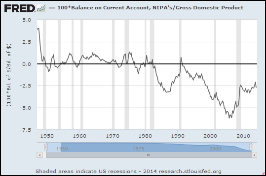
Assuming "Balance on Current Account" is a flow, not a stock:

Graph #1: Balance on Current Account as a Percent of GDP
The accumulated balance was certainly in our favor until the early 1980s. The U.S. in other words must have had an accumulated surplus until the 1980s. Some minor trade deficits, but no trade debt till later.

On this graph you can't even see much instability arising with the closing of the gold window in 1971.

"An incident illustrates..."


Kenneth Arrow, quoted by Lars P. Syll:
It is my view that most individuals underestimate the uncertainty of the world. This is almost as true of economists and other specialists as it is of the lay public. To me our knowledge of the way things work, in society or in nature, comes trailing clouds of vagueness … Experience during World War II as a weather forecaster added the news that the natural world as also unpredictable.

An incident illustrates both uncertainty and the unwillingness to entertain it. Some of my colleagues had the responsibility of preparing long-range weather forecasts, i.e., for the following month. The statisticians among us subjected these forecasts to verification and found they differed in no way from chance. The forecasters themselves were convinced and requested that the forecasts be discontinued. The reply read approximately like this: ‘The Commanding General is well aware that the forecasts are no good. However, he needs them for planning purposes.’
 
On that theme, General George S. Patton:

I would rather have a good plan today than a perfect plan two weeks from now.

Saturday, August 23, 2014

Chapter 3, Part III, Paragraphs 1 and 2


The idea that we can safely neglect the aggregate demand function is fundamental to the Ricardian economics, which underlie what we have been taught for more than a century. Malthus, indeed, had vehemently opposed Ricardo’s doctrine that it was impossible for effective demand to be deficient; but vainly. For, since Malthus was unable to explain clearly (apart from an appeal to the facts of common observation) how and why effective demand could be deficient or excessive, he failed to furnish an alternative construction; and Ricardo conquered England as completely as the Holy Inquisition conquered Spain. Not only was his theory accepted by the city, by statesmen and by the academic world. But controversy ceased; the other point of view completely disappeared; it ceased to be discussed. The great puzzle of Effective Demand with which Malthus had wrestled vanished from economic literature. You will not find it mentioned even once in the whole works of Marshall, Edgeworth and Professor Pigou, from whose hands the classical theory has received its most mature embodiment. It could only live on furtively, below the surface, in the underworlds of Karl Marx, Silvio Gesell or Major Douglas.

The completeness of the Ricardian victory is something of a curiosity and a mystery. It must have been due to a complex of suitabilities in the doctrine to the environment into which it was projected. That it reached conclusions quite different from what the ordinary uninstructed person would expect, added, I suppose, to its intellectual prestige. That its teaching, translated into practice, was austere and often unpalatable, lent it virtue. That it was adapted to carry a vast and consistent logical superstructure, gave it beauty. That it could explain much social injustice and apparent cruelty as an inevitable incident in the scheme of progress, and the attempt to change such things as likely on the whole to do more harm than good, commended it to authority. That it afforded a measure of justification to the free activities of the individual capitalist, attracted to it the support of the dominant social force behind authority.

Friday, August 22, 2014

This is how investigation begins


Graph #1
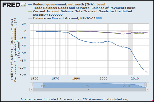
When I look at this graph, I see a period of relative stability, which ended by 1970. After that, a series of downward steps. Each downward step shows a sag in the blue line, a sag that runs from recession to recession. The recessions provide relative high points; but each high point is lower than the last.

I don't see balance sheets. I don't see arguments about how it's really a problem, or really not a problem. I don't see things like that. I see a line on a graph.

Impressions? Sure, I have impressions. My impression is that something is seriously different, before and after 1970. It looks sustainable before 1970, unsustainable after.

I don't think you look at this graph and say "every liability is somebody's asset". That's not an argument; that's a definition.

I think you look at the graph and say Okay, well, the Federal government has been doing something different since around 1970. Best case? Best case, the government has been trying to do good for us, pumping money into the economy, trying to make things better. You know: the "Keynesian" thing.

/// UPDATE 1:46 PM 24 August -- added graphs. Note: On these graphs, the height of the white-background graph area is less, because there are more series titles in the upper blue border. Because the height of the white area is less, the blue line looks smaller. But it's exactly the same data as in Graph #1.

No that can't be right. There's a big sag in the blue line on Graph #2. What the hell... Hey, I did these graphs quickly, but I didn't change the blue line. I bet it's another FRED glitch. I'll get back to ya. I'm supposed to be mowing the lawn...

Graph #2: (Blue Line is the Same as on Graph #1) BAD FRED!!!
Okay... the glitch on Graph #2 has to do with data
frequency. The 10-year space between 1990 and 2000 on the graph
is much larger than the 20-year space between 1970 and 1990.
FRED would say I was careless with data frequency.
I would say they should prevent this kind of error.
For another example see my I don't know what that is, but it isn't GDP
I wasn't sure which version of "trade deficit" numbers to use, so I tried three different ones. The units are all over the place. Red and blue lines are the same, millions of dollars. (The red line is very close to the zero line). The green line was "dollars" so I divided by a million. And the gray line was billions, so I multiplied by a thousand.

I was glad to see gray and green are similar. Makes me think that's a good one to use, either of those.

// REVISED GRAPH #2:

Graph #2 do-over: Just the Blue and Gray this time. Now the blue is as in Graph #1


The next graph Graph #3 shows the gray one as a percent of the blue one. (I did this one over, too):

Graph #3: Balance on Current Account as a Percent of Federal Government Net Worth

Very interesting!

Thursday, August 21, 2014

Federal government net worth relative to GDP, and the Federal debt


Well, I was just going to go with this graph today:


Blue line = the Federal government "net worth" data (from yesterday's graph) converted to billions and divided by GDP.

Red line = Federal debt as a Percent of GDP, expressed as negative values.

But after the responses to yesterday's post, the above seems inadequate. So I tracked down the data behind the "Federal Government Net Worth" graph. I googled Table S.7.q and got to the BEA Integrated Macroeconomic Accounts for the United States page. They list several tables with an "a" suffix (annual) and a "q" suffix (quarterly). Table S.7 in both cases is "Federal government" data.

I'm only looking at annual data as the file is a lot smaller. And only the most recent values -- which is 2012, for some reason. Also, I'm deleting the first 95 line items from the file, to get to the "Changes in balance sheet account" part.


Total assets (line 96) 4626.9 billion dollars. Not far off from the 4 trillion Greg noted in comments yesterday.

Total liabilities and net worth (line 128) also 4626.9 billion. But the liabilities (line 129) are 15245.9 billion, and the net worth (line 145) is -10619 billion.

That's more than enough detail for me.

Wednesday, August 20, 2014

Federal government; net worth (IMA), Level


The units are a bit confusing. The units (in the left side border) are given as "Millions of Dollars". And the lowest number on the vertical scale is given as -12M. That's 12 Million in the hole. But it's not twelve million dollars. It's twelve million million. 12 Trillion in the hole.

But you probably knew that.

Tuesday, August 19, 2014

Effective Demand


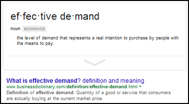
Google:


Small Business by Demand Media:

What Is the Difference Between Demand and Effective Demand?

by Ronald Kimmons, Demand Media

Demand

Demand is the term that economists use to describe the ability and willingness of buyers to purchase a product or service. This is a general term that takes a number of issues into account, such as buyer income, buyer perceptions and buyer needs. Demand is a market force opposite of supply, which is the ability and willingness of producers and service providers to provide products and services on the market. This general idea of demand is often called notional demand, which is composed of both latent demand and effective demand.

Latent Demand

Even if a buyer needs or would be willing to purchase a particular product or service, he cannot do so if he lacks the necessary funds or if he does not know about that product or service. This portion of market demand is called latent demand. The importance of latent demand is that it presents an opportunity to firms to increase revenue by investing in marketing efforts or introducing low-cost products.

Effective Demand

Effective demand is a representation of the actual amount of goods or services that buyers are purchasing in a given market. Effective demand is the difference between notional demand and latent demand. Effective demand is a reflection of the extent to which buyers' income, perceptions and needs combine to result in an actual purchase rather than a mere desire to purchase.

In recent comments at Angry Bear I said to Ed Lambert:

I would suggest again that what you are measuring is potential demand, not effective demand.

Lambert replied:

The term “effective” implies a limit. So it is better than “potential”. But the terms are very close.
Potential output has been surpassed many times, but not effective demand. Effective implies the top limit.

I refer you to the definitions above, from Google and Ronald Kimmons. I still think "potential demand" is the better name for the work Lambert is doing. But of course, I might misunderstand him.

Here's my problem: If I can't get clear on what he's looking at, I can't even begin to understand what he's saying. He's definitely not looking at effective demand as defined by Google and Ronald Kimmons.

//

A year back, at Angry Bear, I wrote:

I’m thinking Lambert’s “effective demand” is really a kind of POTENTIAL DEMAND. After all, Lambert says “The best way to think about effective demand is the unused capacity of demand in the economy.” What he is describing is demand in an economist’s perfect world, just as Potential output is a measure of real output in that perfect world. Though even that perfect world is far from perfect.

Lambert, your explanations help. But your use of the words “effective demand” troubles me because I think it differs from Keynes’ use of those same words, and from Adam Smith’s words “effectual demand”… both of which refer to the amount of money people actually spend.

Back then, Lambert himself wrote:

if unused supply of labor and capital is high, potential demand is going unfilled. Think of effective demand as potential demand. Yet potential demand is constrained by labor share of income.

Effective demand is demand backed by purchasing power. I think Potential demand is a measure of the most that effective demand could be. I think Lambert is doing Potential demand. And I think it might be real genius. But effective demand is something different.

Monday, August 18, 2014

Bad Debt Expense


Corporate bad debt expense:

Graph #1: Corporate Bad Debt Expense
It just goes up more and more and more. But look at it on a log scale. There is a straight-line increase from the 1940s to 1990:

Graph #2: Corporate Bad Debt Expense, on a Log Scale
After 1990, the increase of bad debt slowed.

I find it most interesting that this graph shows no acceleration in bad debt. The graph shows no upcurving trend anywhere between the late 1940s and 1990. It shows a constant rate of increase, despite the growth of debt.

Sunday, August 17, 2014

The Net Worth of the Financial Sector


From Wikipedia:
The net worth of the United States and its economic sectors has remained relatively consistent over time. The total net worth of the United States remained between 4.5 and 6 times GDP from 1960 until the 2000s...

The net worth of American households and non-profits constitutes three-quarters of total United States net worth - in 2008, 355% of GDP. Since 1960, US households have consistently held this position, followed by nonfinancial business (137% of GDP in 2008) and state and local governments (50% of GDP in 2008). The financial sector has hovered around zero net worth since 1960...

That last sentence there, this is the complete thought: The financial sector has hovered around zero net worth since 1960, reflecting its leverage... But the article has already defined net worth as assets less liabilities, so do we need the explanation embodied in those three extra words? Eh...

For me, the key bit of information is that the financial sector has approximately zero net worth.

Next, from the Dallas Fed, working paper #161 from 2013: Is the Net Worth of Financial Intermediaries More Important than That of Non-Financial Firms?...

Oh, that's funny. At the Dallas Fed, the working papers are in a "documents" folder, which is in an "assets" folder:
http://www.dallasfed.org/assets/documents/institute/wpapers/2013/0161.pdf
One can see the central banker's mind at work. But I wonder, do they also have a "liabilities" folder?

... by Naohisa Hirakata and Nao Sudo of the Bank of Japan, and Kozo Ueda of Waseda University. From the abstract:

Our model, which is calibrated to the U.S. economy, highlights two features of the FIs’ [financial intermediaries] net worth. First, the relative size of FIs' net worth as compared to entrepreneurial net worth, namely, the net-worth distribution in the economy, is important for the financial accelerator effect. Second, a shock to the FIs' net worth has greater aggregate impact than that to entrepreneurial net worth. The key reason for these findings is the low net worth of FIs’ in the United States.

In other words, the low net worth of the financial sector magnifies the effect of a shock; and a shock to the financial sector has a greater impact than a shock to the productive sector.

From the conclusion of that paper:

Our results have policy implications regarding the intensified Basel bank regulations that have progressed after the financial crisis. In those regulatory frameworks, the FIs' net worth is expected to play the pivotal role in achieving the financial stability. Along this line, our results suggest that the regulatory framework that protects banks' net worth from irrational exuberance or that fosters accumulation of banks' net worth may be beneficial from the macroeconomic stability purpose.

Mmm. I don't like this. "Basel" is BIS, the Bank for International Settlements. It's a Friend of the Bank sort of thing. But why would we trust bankers to solve this problem? Did we learn nothing from the crisis?

Look what bankers want to do: They want to protect banks' net worth, and foster its accumulation.

I would rather solve the problem by having governments provide more money, and have each dollar of that money turned into fewer dollars of credit than is the case today. I want to reduce the reliance on credit, and increase reliance on the dollar.

I want to reduce the demand for credit and, in so doing, reduce the demand for a financial sector. If we do this, then boosting banks' net worth might help solve the problem. If we do not, then boosting banks' net worth only hastens the day when banks own everything and we are no longer fremen but coloni and slaves.

Saturday, August 16, 2014

Oh, this is precious

I was looking for "Goldilocks economy".

Dated 22 November 2007, from Lawrence Kudlow at Real Clear Politics:

November 22, 2007

Three More Years of Goldilocks?

By Lawrence Kudlow

There was some revealing information in the three-year forecast published by the Federal Reserve this week. It looks like Ben Bernanke & Co. are dissing high oil and gold prices and the sagging dollar as influences on future inflation. Instead they basically see 2 percent inflation -- both headline and core -- in 2008, 2009, and 2010. The Fed also sees Goldilocks-type economic growth -- not too hot, not too cold -- for the next three years.

For 2008, an election year, the Fed is looking at 2.1 percent growth, their lowest estimate. This rises to 2.5 percent in 2009 and 2010.

So how did the Fed's GDP growth prediction work out?


One out of three.

But it gets better. Kudlow offers his own predictions and analysis:
I think the election-year economy will be stronger than the Fed's estimate -- closer to 3 percent. Too much is being made of both the sub-prime credit problem and the housing downturn. A recent Bank of England study shows that residential mortgage-backed securities in the U.S. total $5.8 trillion. Of that, only $700 billion, or 12 percent, are sub-prime. Even when you add in $600 billion of so-called Alt-A mortgage paper, most of which will not default, the total of these home loans is still less than 20 percent of all mortgage-backed paper.

What's more, the entire market in sub-prime debt is just 1.4 percent of the global equity markets. On any given day, a 1.4 percent drop in world stocks would erase the same amount of value as the collective markdown of all sub-prime-backed bonds to $0. It's just not that big a deal.

"It's just not that big a deal," Kudlow says.

You never know.

Friday, August 15, 2014

...because people don't spend money at night?


Yesterday I wrote:

That's a favor policymakers did for banks, not counting the sweeps. But it makes M1SL an unrealistic number.

I don't like to say anything so unequivocal without backing it up (unless I've already backed it up several times. (See? I can't even be unequivocal about that!)).

Sweeps. Jim said:

The way I understand it in 1994 the banks were allowed to change the way they figured the data that goes into computing M1. Banks were allowed to shift the money from accounts that were less active from checking to savings for reporting purposes. Doing this lowered their reserve requirements.

Lowering their reserve requirements is the "favor" that policymakers did for banks.

As for making M1SL "an unrealistic number" I turn to the link Jim provided: Sweep Programs.

Sweep programs create distortions between reported data on the monetary aggregates and accurate measures of the money stock.

I would love to quote that whole page, it is so good. But the whole thing is only three paragraphs, so taking one sentence is taking a lot.

They also provide this reference:
Cynamon, Barry Z., Donald H. Dutkowsky, and Barry E. Jones. "Redefining the Monetary Aggregates: A Clean Sweep." Eastern Economic Journal, 2006, vol. 32, issue 4, pages 661-673.

Barry Cynamon's name is one I recognize. The site is Sweep-Adjusted Monetary Aggregates for the United States, and I (for one) don't go there often enough.

Thursday, August 14, 2014

That's what made the economy good in those years.


Interest rates you know. Rates worked their way uphill from the late 1940s to 1981, and have tended downhill since:

Graph #1: Interest Rates trended upward from the late 1940s to about 1981, and downward since


Here's a bit from my second look post:
... take a look at the rate of debt growth since the 1950s:

Graph #2: Percent Change in the Non-Federal Portion of TCMDO (blue)
If I did it right, the red line is a Hodrick-Prescott trend of the debt data.
The first thing that happened "after the early 1980s" was a slowdown in debt growth! A slowdown beginning in the mid-1980s. Immediately after the early 1980s there was a major downtrend in the growth of debt.

But by the late 1990s, the growth rate of debt was back to normal. Back to 10% annual, give or take. Back where it was before the neoliberals took over. Back where it was in the Keynesian years.

What's different is that in the Keynesian years, excessive debt growth led to inflation. In the neoliberal years, excessive debt growth led to unemployment. That's the main difference.

The problem is the excessive debt growth: the excessive reliance on credit, the excessive cost of circulating money... It's a cost-push problem.

Key concept: the excessive cost of circulating money.

Even though interest rates have been declining since 1981, the source of troubles in our economy is the excessive cost of circulating money.

The cost of interest? No. Not only the cost of interest, but also the level of debt. If you want to borrow a dollar, the cost depends on the rate of interest. But at any effective rate of interest, the cost of existing debt depends on how much debt exists. And we—
We have lots and lots of debt,
And that has made all the difference.


I want to look at "the cost of circulating money". Total cost of interest in the economy, divided by the number of dollars of spending-money:

Graph #3: Interest Paid per Dollar of M1 Money
See how it's low there at the start? Less than 0.5 it is. The 0.5 means $0.50. It means 50 cents of interest paid for every dollar of spending-money in the U.S.A.

The cost of circulating money in 1960 was just about 33 cents for every dollar in circulation. That was low.

It's been up in the neighborhood of $2 (on average) since 1980. Two dollars of interest paid, for every dollar we have. Just to be clear on that: "Every dollar we have" refers to the money we have that we expect to spend. Not the money we have in savings.

The money we have in savings is the recipient of that interest, of course. Oh, and since there is far more money in savings than what we have for spending, the interest paid is far less than $2 per dollar in savings.

You can look at this in terms of income inequality, if you like, to see who's paying what to whom.


There is a problem with Graph #3. It uses M1SL for the money measure. It doesn't count "sweeps". That's a favor policymakers did for banks, not counting the sweeps. But it makes M1SL an unrealistic number. The more realistic number is M1ADJ, which does count sweeps. M1ADJ is bigger than M1SL, so the ratio is lower, as Graph #4 shows:

Graph #4: Interest Paid per dollar of M1 Money (Adjusted for Sweeps)
Now there is a general downward trend from the early 1980s. Not sharply down, but down.

But here's what I want you to see: The latter 1990s. The best years since the 1960s. The "macroeconomic miracle" years.

On Graph #4, the sustained high in the mid-to late 1990s is lower than the sustained high of the 1980s and lower than the brief high of the 2000s. The cost of money -- not the rate of interest, but the cost of interest per dollar of spending money -- was lower during the boom years of the 1990s.

We were paying less to have money to spend, in the 1990s. So we could spend more on the things we wanted spending-money for. That's what made the economy good in those years. That's what made it a boom.

Wednesday, August 13, 2014

Farther back in time...


Ed Lambert recently showed this graph at Angry Bear:

Graph #1: Ed Lambert's Graph Goes Back to the Late 1960s

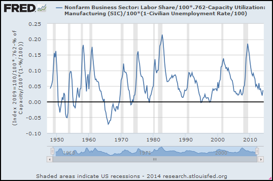
I still don't have a "feel" for what this graph shows. But I notice that the calculation uses Capacity Utilization. I can use the version of Cap-Ut that goes back to 1948 to show more years for Lambert's graph. It won't be exactly the same, because I'll be using Cap-Ut for manufacturing, not for Total Industry. But it'll be close:

Graph #2: Same Calculation, Different "Capacity Utilization", Earlier Start Date
The last couple lows on Lambert's graph (#1) hug the zero line. On #2 those lows are a little higher. That's because U.S. manufacturing is dropping off, relative to Total Industry. It's a different Capacity Utilization. That's okay.

At Angry Bear, Lambert writes:

The UT index wants to stay above 0%. Firms (in the aggregate) do not increase profits when slack goes negative, because firms will pay the increased cost of employing more labor and capital, instead of consumers paying that cost.

As I said, I don't have a "feel" for this calculation. But the graph that goes back to 1948 shows Lambert's UT index going below 0% -- a little bit in the 1950s, and more in the 1960s. The absolute lowest low on the graph occurs in the first quarter of 1966.

According to Steve Keen, Minsky said 1966 was the end of the "golden age" economy. Lambert says things are better for consumers when the line is low like that.

Those things fit together.

Tuesday, August 12, 2014

(When you're trying to find something, it helps if you actually look)


The other day I showed Capacity Utilization for the 1950s, from the Economic Report of the President, 1962. I was surprised to find the graph, and thought I might try to find something on the missing years of the 1960s.

Gene Hayward found some data going back to 1962, which filled the missing years nicely. I checked the source link Gene provided, and found an Excel download for the data he found. Perfect.

Gene sort of inspired me to go back to FRED and rummage around there for more data. And wouldn't you know it, there is a measure of Capacity Utilization for manufacturing that goes back to 1948. I put it on a graph with the one that only goes back to 1967, and I thought it was a good match. Then, for comparison, I added the one for total industry. That was a bit off from the manufacturing series, but not far off.


//

I want to compare Capacity Utilization and real growth. So I put the two series on a graph and adjusted them by eye: multiplied the RGDP growth values by 1.75 to get its up-and-down variation size-comparable to Capacity Utilization... And subtracted 75 from the Capacity Utilization values to move that data down, near to the RGDP data. If I see anything interesting I can always redo the comparison using a Christensen fit.

Meanwhile, here's the guestimated version


Monday, August 11, 2014

Their sevens are funny


Browsing real interest rates, found something at Quandl. I doctored the graph to show the URL, title, and description. Plus, I eyeballed the black trend line and added the red circle. The red ellipse.

Click the Graph to Enlarge it or
Click this text to Visit the Source

What I noticed, sevens aside, was that during the "macroeconomic miracle" years of the latter 1990s, real rates reached and sustained a high, relative to trend.

Sunday, August 10, 2014

Here We Go Loopty Loo

The following post was mostly written back in April, but not finished till now.

A look at loops. This will be another of those continuing investigations, like my recurring look at the Hodrick-Prescott calculation and my recurring look at the "Christensen fit" calculation.

This time we begin with Interpreting Deviations from Okun’s Law by Mary C. Daly, John Fernald, Òscar Jordà, and Fernanda Nechio. I looked at it briefly last April. Let me open by presenting the significance of the loops that appear on their graph, as Daly, Fernald, Jordà, and Nechio see it:
Figure 1 shows the relation between GDP growth per person and the change in the unemployment rate. The gray squares show all of the points, using current data as of December 2013. The solid black line reflects the average...

Figure 1: Real-time and revised loops in Okun’s relationship
Using current data, the solid blue line traces the path of per capita output growth and changes in the unemployment rate from the fourth quarter of 2007 through the third quarter of 2013. As the arrows show, over time these changes result in a clear counterclockwise loop. That is, when the unemployment rate was rising, GDP growth was lower than the average relationship would have predicted. When the unemployment rate was falling, GDP growth was above the average. This path for Okun’s law is an enduring feature of the U.S. business cycle.

Whether we analyze Okun’s law with real-time or revised data, countercyclical loops tracing the relationship over time are a common feature. These loops reveal an underlying characteristic of the U.S. business cycle. Changes in employment—and likewise unemployment—lag behind changes in GDP.

Changes in employment lag behind changes in GDP; this is an enduring feature of the U.S. business cycle.

That just strikes me as massively important. Best of all, their analysis arises directly from the data. From their graph. Their solid blue line makes "a clear counterclockwise loop." It shows GDP growth less than Okun's law predicts in the recession phase of the cycle, and more than Okun's law predicts in the growth phase.

This pattern of offsets from the average also shows up in other business cycles. It is an enduring feature of the business cycle, the authors write.


The article is an examination of the validity of Okun's law. But for me it is an example that clarifies the significance of the loops that appear on many graphs, not just graphs of Okun's law. In the article they do something I never did -- they put little arrows on the graph to indicate the path of the loop over time. Without the arrows, the loop could be clockwise. Turns out, it's counterclockwise. Knowing that, they can say things like "When the unemployment rate was falling, GDP growth was above the average." That's useful information.

The article provides a pretty good description of the data they used for their graph. I want to see if I can duplicate their graph -- not today, but pretty soon. And if I can duplicate it, then I want to see if I can duplicate their results. I want to go through the motions and see if it all makes sense to me.

After it makes good sense, after I'm comfortable thinking in terms of these loops, I want to use their method to examine things other than GDP and employment. Those are both outcome goals: We want growing GDP and rising employment. I want to compare outputs to inputs. Specifically, I want to compare the output goal GDP to input like debt levels. It would be interesting to confirm that GDP grows above average when debt is relatively low but increasing rapidly, and that GDP growth is below average otherwise.

I might also be able to use this tool to evaluate economic performance over time, as debt levels gradually rise.

In the meanwhile, fiddle with Graph #2. Below the graph, the hover-bar contains the values 00, 01, 02, ... up to 22, representing 23 images that highlight 23 different subsets of the full data set. Move your mouse over the hover-bar to highlight different subsets. Note how often Real GDP responds to changes in debt by forming a loop similar to the one described for Okun's law.

The start- and end-date of the highlighted subset appear on the graph, and also the slope value of the black line. Adjust your screen display, if you have to, so you can see the whole graph image plus the hover-bar.

Graph #2: RGDP Growth versus the Change in "Total Debt relative to NGDP
0 0
0 1
0 2
0 3
0 4
0 5
0 6
0 7
0 8
0 9
1 0
1 1
1 2
1 3
1 4
1 5
1 6
1 7
1 8
1 9
2 0
2 1
2 2

The steeper the slope of the black line, the more growth we got.

// Graph #2 originally appeared in Too Much?

Saturday, August 9, 2014

Not the Topic: Revision of GDP


In this morning's 4AM post we looked at Interpreting Deviations from Okun’s Law. According to the article, Okun's law appears not to stand up when you look at real-time GDP data. But when you go back later and look at the revised GDP numbers, Okun's law holds up well.

My real interest is in the loops that they describe. But this stuff about "revision" is fishy. They don't explain that part. And if, like me, you don't know what they don't tell you, the stuff about revising the data can make you wonder what's going on.

I found an article that explains it: at 538, The Messy Truth Behind GDP Data by Andrew Flowers:
From the initial estimate to the first revision, the average absolute change is a little over 0.50 percent. From the first to the second revision, it changes on average nearly a quarter percentage point.

What’s most astounding is how much GDP changes from the third “real time” estimate to its historical estimate as refined by annual and benchmark revisions: nearly 1.5 percentage points. To put that in context, the average quarterly growth rate since 1975 is 2.7 percent. So GDP numbers in real time are, at best, a dim reflection of the state of the economy.

GDP numbers in real time are, at best, a dim reflection of the state of the economy. I think that clarifies the "revision" problem.

Loops


I'm starting to recognize some of the names.

Mary C. Daly, John Fernald, Òscar Jordà, and Fernanda Nechio presented a guest post at The Big Picture back in April: Interpreting Deviations from Okun’s Law.

From the opening:

The traditional relationship between unemployment and output growth known as Okun’s law appeared to break down during the Great Recession. This raised the question of whether this rule of thumb was still meaningful as a forecasting tool...

From the conclusion:

Okun’s law is a simple statistical correlation, yet it has held up surprisingly well over time.

I found the same topic a while back in The Myth of ‘Jobless Recoveries’, a guest post by Laurence Ball, Daniel Leigh, and Prakash Loungani at Econbrowser. I followed up on that one and found that, as the subtitle said, "Okun’s Law is Alive and Well".

But that's not what this post is about.


The Big Picture article says much of the apparent breakdown of Okun's law was due to the use of real-time GDP data. Time and revision of the GDP numbers produced results more supportive of Okun.

That's not what this post is about, either. But you sort of need to know it to see why there are two loops on this graph:

Graph #1: Okun “loops” in revised (blue) and real-time (red) data

This post is about the loops and why they show up on the graph. The authors write:

Using current data, the solid blue line traces the path of per capita output growth and changes in the unemployment rate from the fourth quarter of 2007 through the third quarter of 2013. As the arrows show, over time these changes result in a clear counterclockwise loop. That is, when the unemployment rate was rising, GDP growth was lower than the average relationship would have predicted. When the unemployment rate was falling, GDP growth was above the average.

This is important because it helps us understand more about the economy. When the job situation is improving, GDP growth is improving faster. When the job situation is deteriorating, GDP growth is deteriorating faster. I think that's what it tells us.

"This path for Okun’s law is an enduring feature of the U.S. business cycle", they write: It's not a fluke. It's the way the economy works. Important stuff.

I'm surprised we don't see more of this sort of loop-analysis of economic data. The post by Daly, Fernald, Jordà, and Nechio is only the second one I've seen on the topic.


I looked it up. The post by Daly, Fernald, Jordà, and Nechio is only the first one I've seen on the topic. But this is not the first time I've seen it. I guess that's why I'm starting to recognize the names.

Back in April, Gene Hayward linked to the article. I was all over it the next day. I quoted the article:

These loops reveal an underlying characteristic of the U.S. business cycle. Changes in employment—and likewise unemployment—lag behind changes in GDP.

I responded:

The loops tell us something about the business cycle. What they tell us is that changes in the supply side lag behind changes in the demand side.

The supply side follows the demand side. That's what those loops tell us.

Supply follows demand.

See? The loops are important.

The next day, I started a follow-up post on my test and development blog. But I let it drop. I'm picking up that ball now.