Below is a FRED graph showing the FEDFUNDS interest rate (blue) and the "percent change from year ago" of GDP. These are the same time series used by Rodger Mitchell, as noted in my two previous posts.
By moving the mouse onto the graph, you change the red GDP line to "real" or inflation-adjusted GDP. By moving the mouse off the graph, the line changes back to show nominal GDP again.
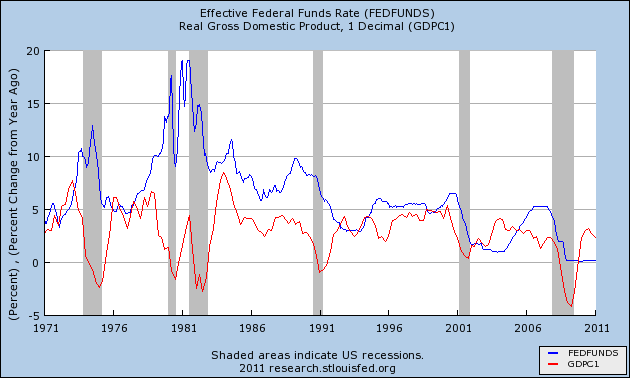 |
Having had a chance to compare both "real" and "nominal" output to the Federal Funds rate via the hover mechanism, I should say that the overall trend of the red line is shaped by inflation into a pattern quite similar to that of the interest rate. But the individual ups and downs that concern Rodger in his post are not so much affected. That is, the "ups" for the most part remain "ups" and the "downs" remain "downs". So, while he uses bad numbers, that choice probably does not affect his argument.

Clearly, Rodger's graph looks different after 1984 than it appears before. Yet, looking again at the graph for the years after 1984, I note that the blue line tends to rise until the red line starts to fall, and then the blue line rises a bit more before itself beginning to fall. This is the same pattern that occurs before 1984: Rising interest rates tend to slow the increase of growth, and lead to recessions.
This pattern occurs around 1984, and again around 1988, and again around 1995, and again around 2000, and again around 2007. Each time, the rising blue interest rate line continues to rise while the rising or flat red line showing GDP turns and starts to fall. Each time, interest rates rise until growth slows down, and often there is recession.
Rising rates reduce growth at lower and lower levels in the years since 1984. This is part of the reason the graph looks different in these years. Nevertheless, falling interest rates still induce growth, and rising rates still hinder growth.
 |
| The Growth of Real GDP |
In the years before 1984, growth very often achieved moments at or above a 7½% rate. In the years after 1984, growth never managed to reach even 5% except during the "macroeconomic miracle" of the late 1990s. This is the reason the graph looks different in the more recent period. It is not that high interest rates no longer hinder growth. The problem more accurately is that low interest rates do not result in the kind of growth they formerly did. (And this, I think, explains why policy allowed interest rates to fall since the early 1980s: It was an effort to obtain growth.)
It likely also explains why Rodger writes: "The history of Fed rate cuts, as a way to stimulate the economy, is not a good one."
Nonetheless, low interest rates do encourage growth and high interest rates hinder it, not only before 1984 but after as well. I cannot accept Rodger's claim that this pattern does not hold. The difference, the reduction of peak growth since 1984, is a result of our greater reliance on credit and on the cumulative cost of that change.

1 comment:
Art -
Not having read the prior post(s) I'm lacking context, so I'll just comment on methodology.
It's really tough to eyeball correlations - or the lack thereof - in a pair of variable time series.
Here, they seem to move sometimes in similar motion, sometimes contrary. Though that can be an artifact of a time lag, it doesn't look that way to me with this data
My simple approach to deficits and inflation was to determining the slope of inflation apparently resulting from the deficit, with a defined time lag (0 to 5 years) and the correlation coefficient. I took data chunks of 8, 13, and 21 years duration and swept them across the entire data set.
With interest rate as your independent vbl and GDP growth as the dependent vbl, you could try the same thing.
It's a bit of work, but you'll be able to say something more definitive.
http://jazzbumpa.blogspot.com/2011/01/of-deficits-and-inflation-part-3.html
Cheers!
JzB
Post a Comment